Final Blog Post

These are a few images from my final draft of my book for this class. My book ended up being about 20 pages long and had about 10 pieces of work in it, but from 5 different projects. Not all of them were from this class.

I didn’t like this class at all, it just wasn’t for me. I like design but the course didn’t have a syllabus or follow a real progression I felt.

I don’t really like writing very much, but it was a good way to recap projects and get a good sense of how cohesive the project was.

It was one of the worst things ever actually going through the process of learning some of the adobe software, but once I got the hang of it it was something I was glad I learned how to do because I probably never would have tried to go through the trouble on my own.

I didn’t really grow from anything other than learning how to use the different adobe operating systems, which is expected because that was the majority of the class content, but that is a really good skill I’m glad I had the chance to spend time doing and learning.

Student Book Weekly Report Update

So far I’ve decided what design pieces I’m going to put into my book and I’ve started to design my cover and personal logo for the start of the book. I’m thinking about using different black and white backgrounds for my book to put my text and design projects on, and possibly add texture to them using indesign.

I’m going to use the ambient ads, the hotel design logo project, the 3 ads for a restaurant, and a few outside projects for the book. I’m not sure yet on the order of the pieces and how they’re be put into my book.

I want to give the future reader the impression that the book is not just a vehicle for the designs, but is also a design in itself.

I kind of wish we did more design projects throughout the semester so I would have had a wider variety of projects to chose from and to really use more of a range of design possibilities for different projects. I wasn’t even sure at first if we even did 5 real design projects which doesn’t give a lot of room for mistakes or not being happy with the work afterword to omit things.

Project Update: 3 Ambient Ads

The company I chose to do advertisements for is Lululemon Athletica.

Of my 10 ideas I submitted I have chosen to take pictures of:

  1. The OU Dance and performing arts building
  2. The stadium bleachers
  3. Treadmills in the huff (Sarkey’s Fitness Center

I feel like all three of these locations really reflect a few of the different ways people are involved with the brand, and where they wear it, while all also really encompassing the spirit of the University of Oklahoma campus.

People wear the brand for different athletic uses and activities, so they all really show diversity.

I have not taken the pictures for this project yet, but I have very clear ideas in my head of exactly how I want the photographs to come out. I also have found the font I will be using. I was preoccupied celebrating the sooner win in Bedlam this weekend. BOOMER SOONER

Taps Ad Portfolio Page

Screen Shot 2017-10-19 at 7.09.01 PMScreen Shot 2017-10-19 at 6.44.21 PMScreen Shot 2017-10-19 at 6.44.00 PM

This assignment was to produce three different advertisements for a holiday campaign for any of the given restaurants provided to try and get more people attracted to the location. I chose Taps Brewery & Restaurant, a bar and restaurant located in an urban area in Istanbul.

My ideas for the campaign involved developing well known holiday sayings and tagline into a more restaurant and bar geared saying that would still be recognizable. I also tried to exclusively use grey scale, red, black, and white in my advertisements to keep them cohesive throughout all three and use a more holiday driven color scheme. The black and white creates a warm and simple feeling, while the red keeps the tone of the holidays in the advertisements. I found images related to bar and restaurant life that had the rustic feel of the actual restaurant in Istanbul and changed them to greyscale and edited them to have the right feel of the holidays.

Taps Ad Campaign Reflection

I really like the color scheme I used with my three ads for Taps Brewery & Restaurant because it tied in with the holidays and also used the red from the restaurants logo. The use of only black white and red made the messages on the ads really pop.

I also liked using the black and white stock images to give it some sort of style and make it look a little more modern and fun.

I think my least favorite thing about the design is the cohesiveness of the typography and my use of multiple fonts throughout all of the ads. I think individually all of the fonts look good on each ad, but they’re different throughout all 3 which could have a negative impact on the cohesiveness.

I think my design technique has improved a lot over the past few weeks. I feel like I have a lot of ideas on how to design different layouts and have creative ideas, but I didn’t have the skills to really execute them. I had a good understanding of composition of a design but not how to fully create it on an ad as apposed to visually attractive presentations.

Logo Design Project Reflection

Throughout the designing process my design has improved in color scheme and in overall design and layout. The original design I had submitted was something I liked, but it definitely didn’t have the versatility of my final design, which is something that was pointed out to me.

It isn’t as much the design I’m proud of as the fact that I was able to actually get a good enough grasp on Illustrator to make it somewhat come together. The alignment was something that was difficult for me to accomplish, so that the text would go around in a circular shape. I’m least proud of the color scheme I ended up using. Originally I wanted to use gold and green to encompass the statue of liberty with the colors, but it didn’t really end up working for a realistic logo. I didn’t really know what other colors to sue besides the ones I used because I felt like the blue color was a classic Disney color and was the only one I could think to use.

I definitely think that the technology hindered my creative process. I had a lot of ideas right off the bat for this project, but couldn’t get a good enough grasp of the creative platform to successfully execute them, which led me to creating a much simpler design.

Logo Portfolio

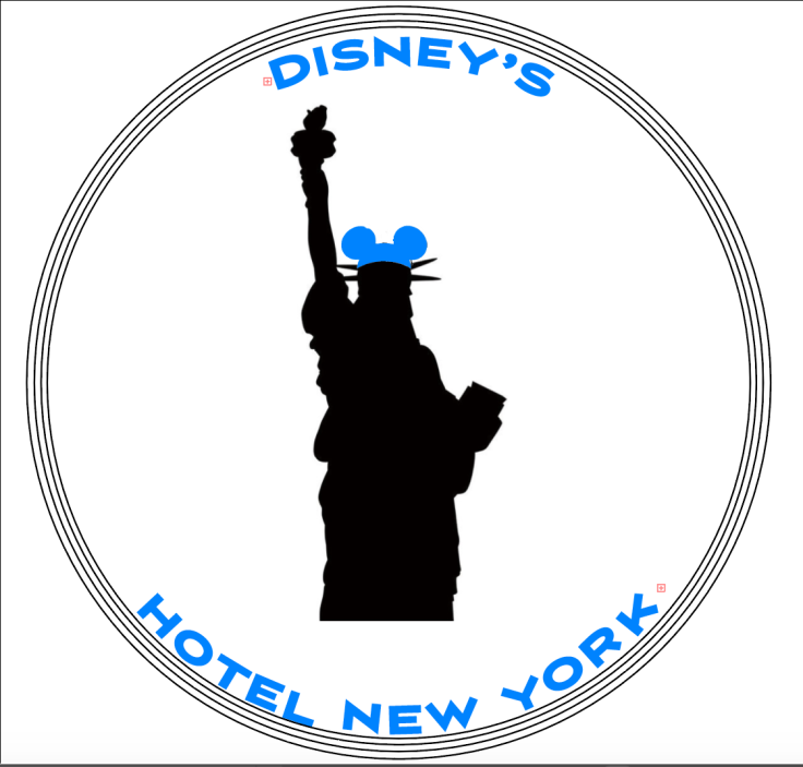
The assignment for my copy and layout class was to redesign a logo for a hotel and improve upon the overall aesthetic of the logo to help it better represent the brand. I chose Disney’s Hotel New York to redesign.

My main goal was to incorporate the true feel of Disney into this design, because it didn’t really create that feeling of the happiest place on earth, and I wouldn’t have originally known it was Disney if the word “Disney” wasn’t on it. I also wanted to have less colors than the original logo, which originally had 5 colors on it. Throughout this process I really was able to get a better grasp on the use of Illustrator, which in the beginning was my main frustration with this assignment. Becoming more comfortable with the design platform allowed me to do more with my design and try to execute more creative ideas.

Screen Shot 2017-09-24 at 9.46.53 PM

This was the final design I created for Disney’s Hotel New York.

My logo changed a lot throughout the process originally due to frustrations with using the design platform and also due to feedback from multiple people on how to improve the overall look of my logo and the color scheme.

Some of the old designs can be found here: https://lindseystorey.wordpress.com/2017/09/14/logo-round-1/

Logo: Round 1

Screen Shot 2017-09-14 at 1.17.37 PM

I chose Disney’s Hotel New York for my logo to redesign, it was one of the first ones that I immediately had some ideas for.

My biggest objective with this redesign is to make a very recognizable and unique logo that stands out and really simply represents Disney, but I also want to add a little bit of flair to it at the same time.

This was actually the second design that I tried to create, the first design was a lot more similar to the original design we were given and it was a good concept, but I struggled o actually create mostly because of lack of knowledge of Adobe software. Screen Shot 2017-09-14 at 1.20.12 PM

This was the first design that didn’t really come together as nicely and was abandon midway. This was my biggest frustration because I feel like it was a better concept but I couldn’t really get it to turn out how I wanted.

My biggest inspiration for both designs was the statue of liberty because it is such an iconic monument that is recognized not only by Americans but worldwide.

I have had other ideas of what to add since I finished my design (about 30 minutes ago) and plan to experiment with them in a later draft just to see where else the design could take me and see if I can further the efficiency of the message. I’m not sure if I could somehow accentuate the “Disney” concept more within the design.

My first date with Illustrator, 10/10 would not recommend

Screen Shot 2017-09-08 at 12.54.38 PMAs someone who is way more comfortable with photoshop than illustrator I didn’t enjoy trying to learn how to use a new platform to do similar things I could’ve done in photoshop.

I’ve never really used illustrator before and I found it extremely frustrating, even after watching tutorials it was hard for me to follow along because of my total lack of knowledge, so I had to pause between literally every step to be able to complete any simple task or find a tool that I needed.

Screen Shot 2017-09-08 at 12.53.52 PM

Here is where I finally found the brush tool and wrote my name. It was really time consuming for me to figure out how to do things that ended up being very simple in the end.

http://www.complex.com/style/2012/04/gallery-worst-drawings-on-draw-something/

I relate heavily to every artist in the above article.

Screen Shot 2017-09-10 at 5.18.33 PM

After all of my struggles, I finally was able to create a simple shape with color and add my initials. I’m not sure how people become extremely skilled and have authority in Illustrator, but I think it will get easier from here on out.

Create a color Scheme

Screen Shot 2017-09-05 at 1.15.51 PM

For the pizzeria challenge on Lynda.com, I created a color scheme using red, green, white, brown, and tan. I thought the use of white green and red was essential because they show the true Italian roots of the restaurant because they are the same as the colors of the flag of Italy. I also incorporated brown and tan because they remind me of dough, bread, and meat, and the shop is not just a pizzeria but a deli as well. The earthy tones of the brown and tan also bring some warmth to the contrasting red and green colors that are more bold.

Create a website or blog at WordPress.com

Up ↑